Research
Genres
My approach began with a research phase to determine the most suitable genres and books for the landing page design. My selection process was driven by the desire to feature genres that not only have broad appeal but also showcase best-selling titles, famous works, and the latest influential books. The genres I chose—Self-help, Mystery/Thriller, and Memoir/Autobiography—are rich in content that resonates deeply with a wide audience.
The selected books are not only among the top sellers but also highly regarded for their impactful content. As an avid reader with a keen interest in these genres, My selection is rooted in a blend of professional strategy and personal passion, aiming to create a landing page that highlights these remarkable titles and appeals to fellow book enthusiasts.
Business Plan
I bought a book-selling plan that centers on a subscription-based e-book platform. This approach is designed to cater to diverse reading preferences by delivering a handpicked selection of 10 top-selling and most popular books each month, drawn from a varied mix of genres. To accommodate different reader types and reading frequencies, the platform offers three subscription tiers: Free, Lite Reader, and Advanced. Each tier is tailored with specific features and conditions to match the varied needs and interests of subscribers.
Diverse Genres - By featuring books from a mix of genres, the platform caters to a wide range of interests and preferences, making it easier for subscribers to explore new topics and stories.
Monthly Updates - The monthly refresh of the book selection keeps the content dynamic and engaging, encouraging regular exploration and discovery among subscribers.
Tiered Subscriptions - With different subscription levels, users can choose a plan that best suits their reading habits and access needs, ensuring value for every type of reader.
Branding
I focused on creating a distinctive brand for the landing page that aligns with MailerLite's existing branding while also introducing thoughtful improvements.
Here's a comparative breakdown of the branding aspects and the enhancements made:
Logo - The original MailerLite logo is simple and modern. For the landing page, I designed a logo that maintains this simplicity but introduces a playfulness that connects with the diverse and lively nature of the selected book genres.
Color Palette - MailerLite's color palette is known for its clean and minimalist vibe. In the palette I crafted, I preserved the essence of minimalism while infusing more vibrancy to convey the richness of content offered by the book subscription service. The chosen colors are meant to be eye-catching yet harmonious, creating a visual appeal that enhances user experience and facilitates navigation.
Typography - Consistency in typography is key for brand recognition. Therefore, I've used the same typography as MailerLite to ensure brand consistency. This decision is strategic, allowing users who are familiar with MailerLite's visual language to navigate the landing page with ease.
Look and Feel - MailerLite’s overall look and feel are defined by minimalism, which I have respected in the landing page design. However, I introduced subtle enhancements that make the design more dynamic and engaging without overwhelming the user, ensuring the landing page remains clean, focused, and effective in showcasing the books.
The branding enhancements aim to draw in and keep a varied group of users, boost curiosity and sign-ups for subscriptions, and provide a pleasant user experience that showcases the e-book service's quality and value.
Design Process
The Moodboard

Moving on from branding and book selection, I initiated the design process for the landing page. Before diving into the creation of low-fidelity wireframes, I compiled a mood board to encapsulate the essence of MailerLite's design patterns. This moodboard was carefully assembled using screenshots from the MailerLite website to draw inspiration for the project's design language.
Low-Fidelity Wireframes

This stage allowed me to lay out the fundamental structure and components of the page without getting bogged down by details. Wireframes served as a blueprint, guiding the placement of elements such as the navigation bar, book listings, subscription plans, and call-to-action buttons.
Design System

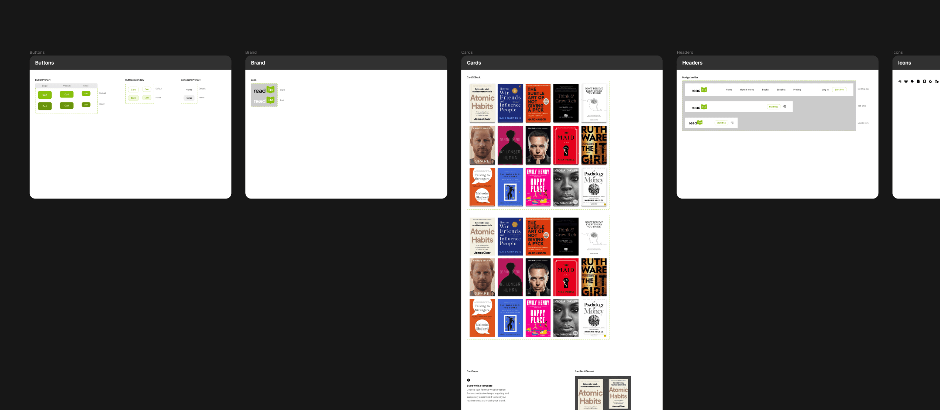
I progressed to finalizing the design system for the landing page.
For the components, I've designed a set of buttons and headers that align with the visual harmony of the page. These components reflect MailerLite's design language—simple, modern, and user-friendly—while ensuring they serve their functional purpose effectively. Since the color palette and typography were already established during the branding phase, my attention centered on creating consistent, reusable design elements.
Figma Tokens and Auto Layout

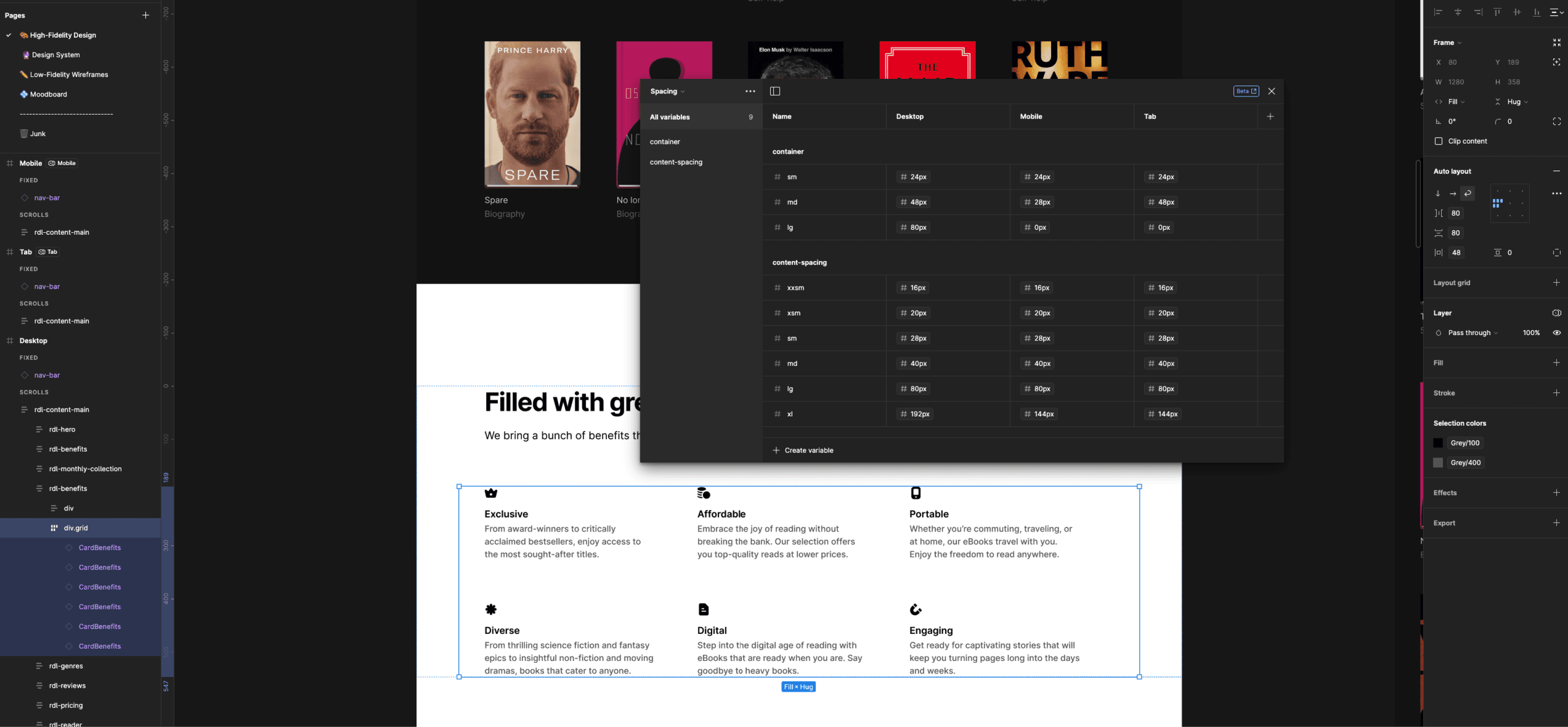
Used Figma's latest design methods such as the token system and auto layout to create consistent and straight forward visual designs.
High-Fidelity Layouts
In crafting the high-fidelity wireframes, I focused on detail and precision, combining branding and design choices into a clear, engaging layout. This step gave life to the page, merging color and typography with user interaction elements, refining the path from browsing to subscribing. Every detail was fine-tuned to enhance the user's experience.
Hero section
In designing the hero section, I embraced MailerLite's minimalist ethics to create a user experience that’s straightforward and inviting.This design mirrors MailerLite's preference for clean, uncluttered interfaces that enhance user engagement without unnecessary complexity.
How it works section
The section detailing the benefits of using my book-selling landing page is designed to inform users about the ease and convenience of the service. By breaking down the journey into five steps, I aimed to simplify the process and make it accessible to potential subscribers.
Benefits section
This section is important because it tells people about the service and why they should sign up. It points out that the books are exclusive, affordable, can be read anywhere, come from diverse genres, are digital for easy access, and are really engaging to read. Explaining these benefits makes it clear to potential users how the service can fit into and improve their daily lives, whether they’re looking for top-tier titles, trying to save money, reading on the go, enjoying different kinds of stories, moving to digital reading, or just looking for something captivating.
Testimonials section
I included a testimonial section to share feedback from real users. Reading positive comments from satisfied readers can really help someone decide to sign up. It's like hearing a good review from a friend; it makes you trust and want to try the service for yourself. It’s all about building trust and showing that the service is loved and valued by people who enjoy reading.
Subscription plans section
The subscription plan is all about giving potential readers the information they need to make a choice that's right for them, making the service feel more personal and flexible. This part is key because it gives everyone a clear choice based on what they can afford and what they want from the service.
There's a free plan which is great for people who want to try it out without paying anything. Then there are 'Lite' and 'Elite' plans for those who want more books and exclusive content. Each plan also has a 30-day trial, which is a good way to test things before really getting into it. By showing all the plans side by side, people can easily compare and pick the one that suits them best, making it more likely they'll sign up.
The Design Summary
I created the 'ReadLite' landing page, drawing inspiration from MailerLite's clean and intuitive design. I've customized the layout to align with the unique preferences and requirements of my book subscription.
The color palette I chose is vivid and attractive, to reflect the diverse and rich content offered through the books. This choice was intentional to catch the eye and spark interest in a wide range of readers.
For typography, I've maintained readability and simplicity, ensuring that information is easy to digest, which is crucial for engaging users who may be scanning quickly. My goal was to balance visual appeal with functionality, mirroring MailerLite's approach but with a unique twist that speaks to a literary audience.
In every part, from the top to the bottom of the page, I added a little bit of 'ReadLite' character. Although I used ideas from MailerLite's simple and goal-driven design, I also added things that show the fun and happiness of reading.
The resulting design of 'ReadLite' aims to resonate with users looking for a seamless, accessible, and delightful book discovery experience, maintaining the professional quality of MailerLite's branding but with an significance on the unique value 'ReadLite' offers to its subscribers.
GIF Animation Failures
I tried adding custom animations designed with After Effects, but ended up with not placing them on the design due to the high resolution and file size it was a failure, then I tried placing the same animation converted to a Lottie animation but later I realised the mismatch of MailerLite's design language and the animations I am trying to add, take a look at a sample animation I built. (This was built be placed under the Benefits section)
Implementation
I started turning the design into a real website using HTML and CSS, without using any extra libraries or JavaScript; I just stuck to the basics as the assignment asked for. I carefully turned the design from Figma into code, writing everything clean and clear. For the styles, I really got the most out of CSS to make sure the website looks just like the design and works smoothly. Finally I could finish the implementation of my landing page successfully by making it a responsive design for the main devices like desktop, mobile and tablet.
Outcome
Working on this project for MailerLite was a really great experience for me. Starting with the selection of genres and books, I carefully curated titles that would resonate with potential readers. The branding phase was a chance to align with MailerLite's aesthetic while infusing unique elements for the 'ReadLite' identity.
Crafting the design system, sketching the initial wireframes, and designing the high-fidelity versions were steps that showcased the planning behind the user experience. When it came to the implementation, building the website with HTML and CSS from the ground up was both a challenge and a delight, ensuring responsiveness and accessibility.
Seeing this project through from concept to launch has been a rewarding journey, and putting together the case study allowed me to articulate the reasoning behind each choice, illustrating my commitment to design excellence.
I'm really happy with how it all turned out, and I'm thankful for the opportunity to do something like this for MailerLite. It's been been a fantastic chance to grow professionally, pushing the boundaries of my skills, and delivering a product that I'm truly proud of.
